We’ve got exciting news to share today – Applivery has a brand new look!
As the Applivery family grows, we expand our areas of focus and update the user experience of our products with the aim of improving their usability and optimizing our customers’ productivity, we want our brand to best reflect why we exist, what we believe in, and where we’re headed.
At Applivery, we think of our brand as a continuous project that’s never totally done. Just as people, relationships and businesses evolve, so do brands. We, too, have never stopped changing from the very beginnings through our products, our company culture and our incredible relationship with our customers of which we are especially proud. Today, we’re taking a bold step forward with a new logo and identity system for Applivery and our products.
None of this could have been possible without the continued support of our customers. Your inspiration has made this change possible.
The Applivery logo
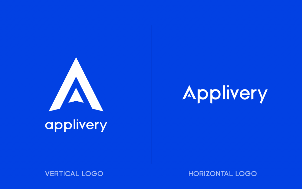
At the heart of this rebranding is our core focus on the productivity, simplicity and security that our products bring to our customers.
From our origins we had the objective of simplifying the experience of mobile app distribution across iOS and Android. We later added our mobile device management capabilities, a major step forward for Applivery in bringing value to our customers across operating systems, manufacturers and technologies, offering a unified, open and flexible user experience.
We believe that when work is open and collaborative, the potential of teams and productivity is unleashed. Infused into our values, product experience, and business model, this philosophy encourages teams to think, work, and behave openly. Working openly helps break down the barriers and silos that separate people from each other and from the information that is critical to carry out their functions.
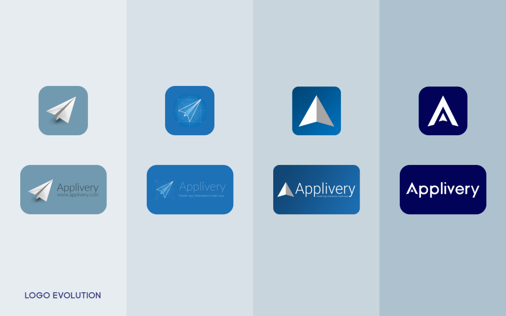
We have incorporated this belief and philosophy into our new logos, focusing on the specific benefits we want our customers to feel when using our products. Like us, you may notice an important symbolism in the new Applivery logo, without leaving behind our characteristic paper plane that represented lightness and agility: our plane protected by a secure, agile and open environment, forming the letter A.
Our new color palette
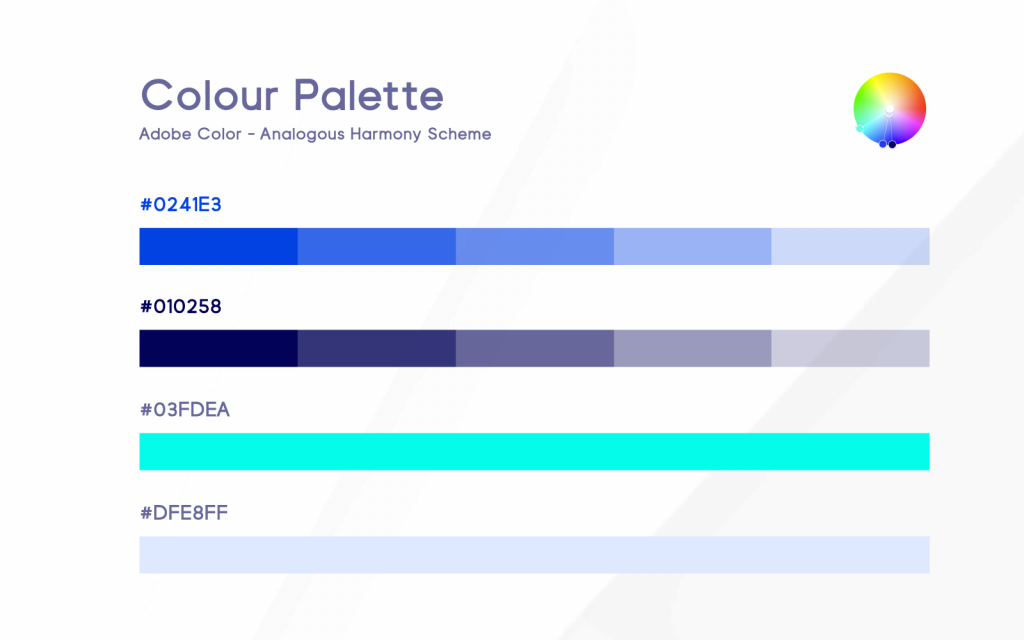
As we get older, our perception of shapes and colors also evolves. As in all businesses, our customers and the sectors in which we work and deploy our solutions have also evolved. We wanted to reflect this change and maturation through a new color palette that integrates us into corporate environments without losing the freshness that makes us different.
Our new product logos
Now that the family has grown with the addition of Applivery Mobile Device Management for Apple and Android, we want to add new logos to help identify our products across the platform and according to their main features. One of our main challenges was to design a visual system capable of representing in a simple way the enormous number of functionalities that our products offer, in a unified way with our main brand. Not easy feat!
Our new typeface
We introduce our new typeface, Visia Pro. A Geometric Sans-Serif typeface that represents a perfect blend of elegant, minimal and premium design aesthetics at it’s level best.
Designed to maximize legibility, it also gives us great flexibility and adaptability to the complex ecosystem in which we find ourselves. Most importantly, we believe it has the ability to stand the test of time.

Our brand new website
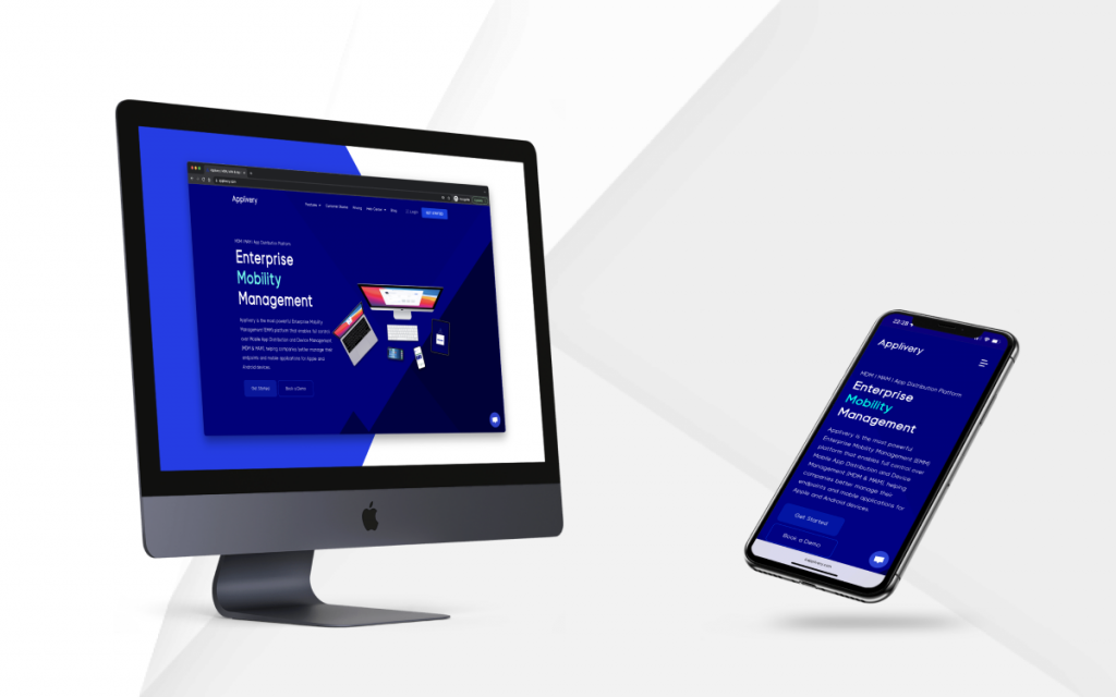
This big step also deserved a redesign of our website. As our products evolve and reach new heights, we need a better way to communicate their capabilities and functionalities. We are in an ever-changing ecosystem where new technologies and devices are appearing almost every day. In the same way, we must be able to adapt ourselves to offer that flexibility and agility to our customers. Likewise, we firmly believe that the best way to communicate the benefits and advantages of Applivery is through the words of our customers.
For all these reasons, our new website not only aligns its look & fell with the new branding but also incorporates numerous new sections to better communicate our new products, their capabilities and the customer stories along the way.
We also incorporated a brand new documentation center and a super-powered help center to continue improving the excellence of our customer service and hoping that our new website will not only be a better communication channel but also a useful tool for our customer.
The foundation of the new Applivery
Starting today, you’ll see these exciting changes out in the wild, and gradually over the coming months, in-product.
But this is only the beginning. We do not want to miss the opportunity to announce that, in alignment with the new brand and what we intend to convey with it, we are working on a complete redesign of the Applivery Dashboard that will offer, for the first time, a completely unified experience in the management of applications and devices, focused on the productivity and agility.
Stay tuned because there’s much more to come – onward, team!


